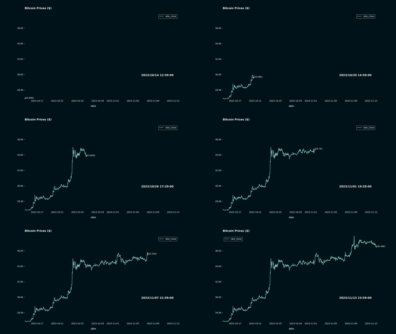
How to animate a plot.
Project Overview:
So, there I was minding my own business when I came across a post on Reddit: Pynimate.
I decided that I wanted to try this out for myself! So, I dug into my crypto coin dataset and pulled the last 30 days worth of data.
Data Analysis Projects
How did I make this? I used a library called Pynimate to bring the data into a Pandas dataframe and then plotted using Matplotlib and Pynimate. Here's the source code in GitHub: data_animation
Bitcoin Prices for the last 30 days

So as you can see, the Bitcoin market is quite volatile.